Build one focused page
- Why
- At pre-launch, the brand had one lead product and a small set of visitor questions.
- What changed
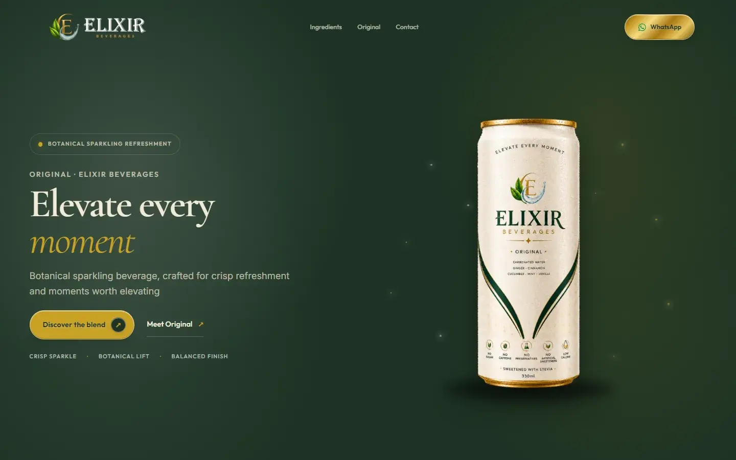
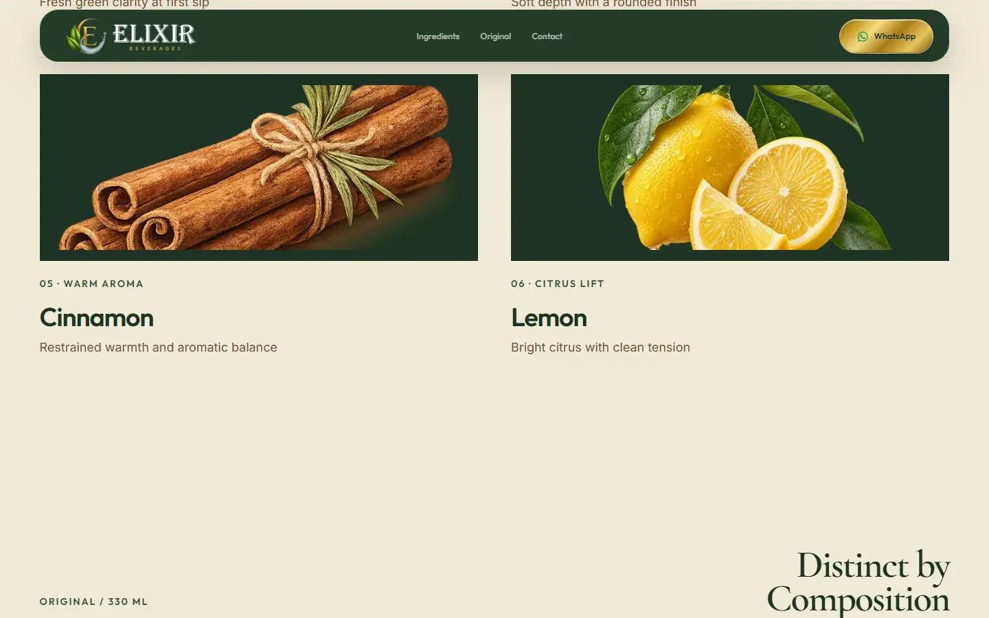
- A single scroll journey moves from the product promise to botanicals, the can and contact options.
01 / Where they started
A focused first impression for a new botanical drink
Elixir asked for a premium 3D website. Together, we shaped a clearer launch presence: a distinct product story, a focused website and ways for early customers and trade partners to get in touch.
Elixir was preparing to launch. There was no earlier website to compare with the finished one.
The starting point, before Kraftt’s website work

Elixir Beverages is a pre-launch botanical sparkling refreshment brand. With no established website, its early logo and product references lived in conversations and concept images. The work connected the product story and first enquiries in one online experience.
A quick picture of the business
The founders initially wanted a luxurious multi-page 3D website. At this stage, the more immediate need was a coherent brand presentation and a simple path for people interested in the product or distribution.
The request set the direction. The visitor journey shaped what we built.
A premium multi-page 3D website with scroll effects.
A clear brand foundation, one focused launch page and separate ways for consumers and trade partners to get in touch.
Elixir was preparing to launch. There was no earlier website to compare with the finished one.
The drink needed a clear identity and product story.
Visitors needed to understand the can and botanical ingredients.
Consumer interest and trade enquiries needed different next steps.
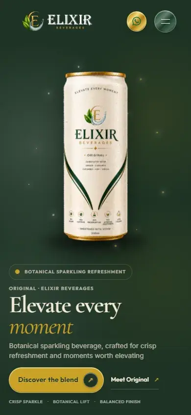
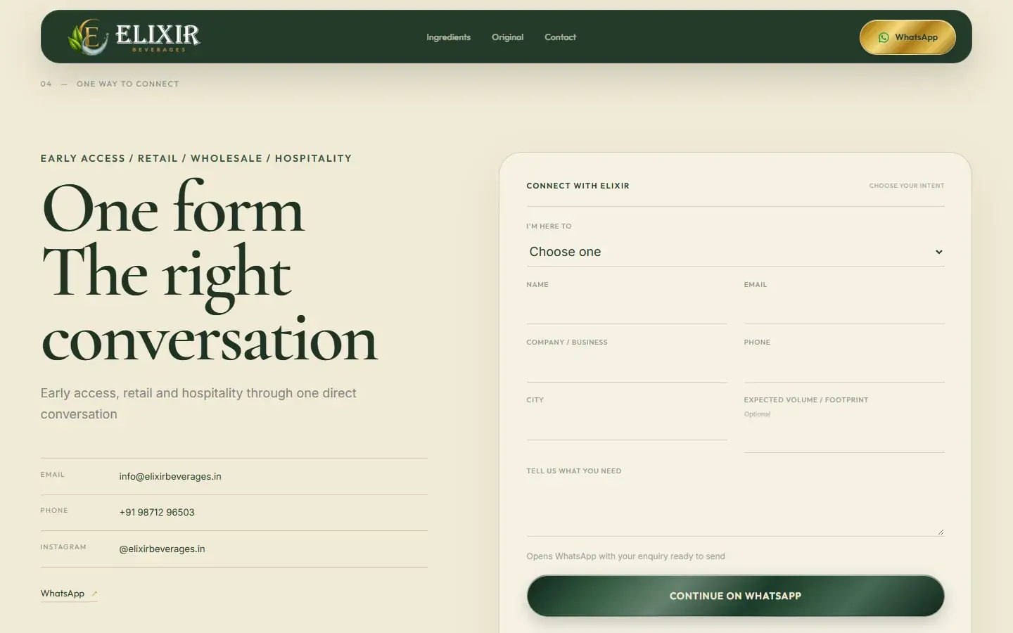
Deep green, warm ivory and the chosen mark carry the same product story across desktop and mobile.
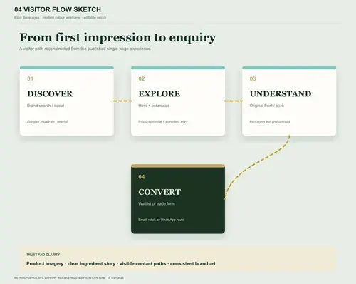 Early visitor-flow sketch
Deep green, warm ivory and the chosen mark carry the same product story across desktop and mobile. Visit the live site ↗
Play when you’re ready. This screen recording is silent.
Here is the difference between what we delivered, what it was meant to improve and what the supplied evidence actually shows.
Open the site and you can see it
The visitor problem it addresses
The honest read of available proof
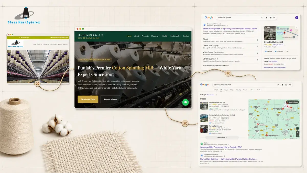
The supplied brand-search capture shows the launch site in one view. A dated report would be needed to assess traffic or enquiries.
Handled my project very professionally and also assisted with us as a brother, we reached out for a 3D website but with proper guidence we got to know the importance of branding for our startup. Really appreciate!
Ayushman MithalClient · Elixir BeveragesOriginal screenshots from the project’s results folder. They record individual views; search and AI results can change by time and place.
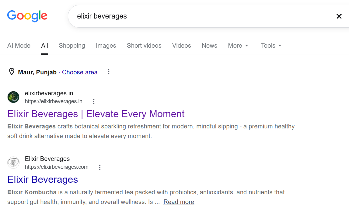
The supplied view from Maur, Punjab shows the launch site for the brand-name search. This is one observed search result.
Supplied 18 Oct 2026 · Original capture date unknownA launch website should make the product understandable and give interest somewhere useful to go.
Next, we would compare the consumer and trade enquiry routes against a dated baseline after launch.